Tag: design

  • Adventures in Podcasting with SoundCloud (Volume I)

    Adventures in Podcasting with SoundCloud (Volume I)

    .code {
    text-align: left;
    font-weight: bold;
    line-height: 1;
    }

    I’ve been podcasting and building my website for a couple of years now, and I thought it would be useful to some people if I talked about some of the things I’ve gone through in getting my site up and running that I couldn’t find anywhere else on the Internet. This one is all about podcasting efficiently with SoundCloud.

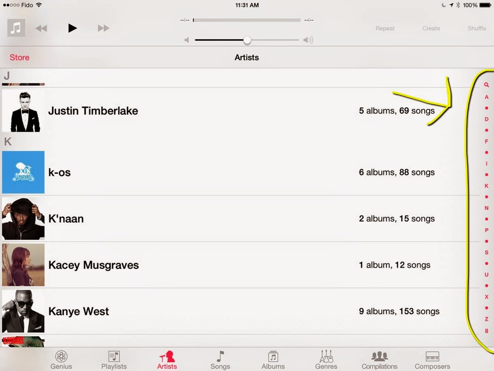
    Now, I’m not a professional programmer by ANY stretch, but I like getting my feet wet with little bits of code from time to time. I also podcast a few times a week, and sometimes I’m lucky enough that these hobbies overlap! I recently moved my podcasts to SoundCloud, and they have a really nice web player (check out unwindmedia.com/feedback for a prime example). But I wanted to simplify my life and use one link for the RSS feed and for the web player embed.

    Luckily, they use a unique ID number for each upload to SoundCloud, it’s just a matter of finding it. It is a 9-digit number smack in the middle of the enclosure URL that SoundCloud uses for RSS, something like this:

    http://feeds.soundcloud.com/stream/204094299-channelname-episodename.mp3

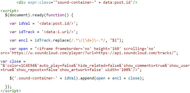
    With a bit of Regex and replace magic (/.*/(d+)-.*/, “$1”) and some simple jQuery, I can extract that number, plunk it into the embed URL (see this page), and stick that into your container div.

    Once you have that embed URL, you just have to put in all the embed options you want for your widget, and you’re good to go!

    As SoundCloud opens up their platform to make it easier for podcasters, I hope this helps you simplify your life. I personally used this code on my Blogger site (unwindmedia.com) so I can have an audio player on my site that uses the enclosure link for the podcast episode, but in SoundCloud’s native player. It’s working incredibly well and I’m moving all my shows to this template in the coming weeks.

    The code I used is below, and you can see it in action online at unwindmedia.com! If you have any questions please ask and I’ll give you all the details you could ever want!

    EDIT (May 8): I made the code a lot simpler and got rid of redundant divs. Hopefully this is even simpler now.

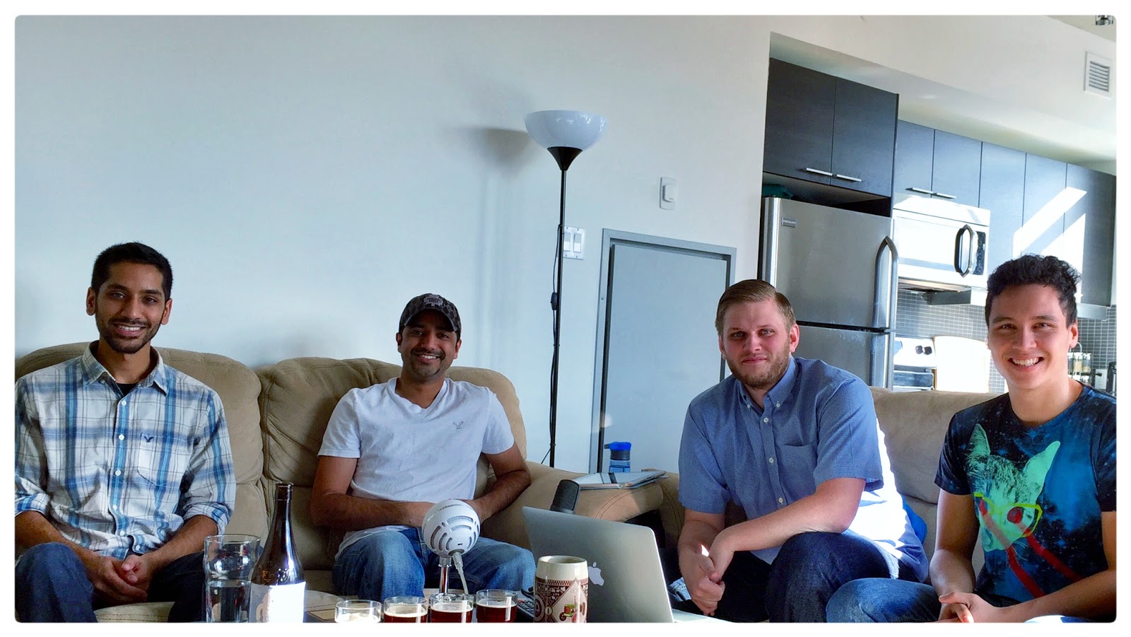
    Pictured: Fun for Rob

    <div class=’”sound-container-” + “POST-ID”‘/>

     <script>
        $(document).ready(function() {

            var idVal = ‘POST-ID’;

            var idTrack = ‘ENCLOSURE-URL’;

            var encl = idTrack.replace(/.*/(d+)-.*/, “$1”);

            var open = “<iframe frameborder=’no’ height=’160′ scrolling=’no’ src=’https://w.soundcloud.com/player/?url=https://api.soundcloud.com/tracks/”;

            var close = “&color=1C4E94&auto_play=false&hide_related=false&show_comments=true&show_user=true&show_reposts=false&show_artwork=false’ width=’100%’/>”;

            $(‘.sound-container-‘ + idVal).append(open + encl + close);

        });
    </script>

  • The iPhone and Battery Life

    The iPhone and Battery Life

    Discussion about iPhone and iPad battery life has been swirling about the tech world of late. Specifically, the idea that many Apple products are made in service to an “ideal” battery life has come up in many of the circles I follow. Jason Snell wrote a very nice piece showing how Apple “solves” for battery life in their products based on thinness and size, but I’d like to take that a little bit further.
    I read all kinds of tech news throughout my week, and most weekends talk about technology and the science behind it on +Future Chat. I also listen to hours of podcasts on subjects such as these. I hear grumblings about the iPhone and how its battery doesn’t last all day.
    There are MANY people who say that they wish they had a phone battery that lasted more than a day, or that they are heavy users and find that their batteries get them to the afternoon, but generally not much longer.
    The fact is, humans are creatures of habit. We have gotten used to plugging our phones in every single day. If you had an iPhone with twice the battery, and only needed to charge it every other day, I can guarantee that more people would have their phones run out of battery than that happens to now. The only people this wouldn’t happen to are people who would just continue to charge their phones every night regardless of its battery level at the end of the day (much like most laptop users, although that MacBook battery life on Yosemite is craaaazy). 
    Basically, the use case for a battery that lasts two days is a person who uses a larger amount of battery than average, and so they use a typical “two day” amount of power in just one day. We call these people “power users”, and Apple themselves typically haven’t served them directly by giving their phones or laptops larger batteries. What Apple does do, though, is pick and choose what they think are the best solutions for those power users, and stock them in Apple stores. Examples I’ve used (as I like to think of myself as something of a power user) include the Mophie Juice Packs and the Mophie Powerstations. These are basically cases and power bricks that let you extend the use of your phone beyond a normal day of use, and they are wonderful!
    I love the way my phone looks without a case, but when my battery gets low, I love being able to either stick it into a case or plug it in on the go, and I immediately don’t have to worry about my battery dying. For the extra $80-100, it’s a no-brainer to carry a case or battery pack around with you, along with Lightning and micro-USB cables (I have a wireless headphone fetish, some would say).
    Now, recently Apple released the iPhone 6 Plus. As Jason mentions in his post, this phone breaks the Apple mould, giving users a significant jump in battery, something closer to a tablet in usage than a phone. In effect, this release tells me that Apple hears that some power users have made enough noise that Apple is giving them an option to have a larger battery, as thus use their phones more.
    If you’re worried about battery life in your iPhone, or other mobile device because it doesn’t last days or weeks, you might be waiting a long time. Battery improvements come incrementally, and something tells me even if we do get the 10x battery power increase many stories promise for the eventual future, all we’ll get is a device with a 10x smaller battery. And that’s just fine with me!
  • Ottawhat #26: Shawn Bashir

    Ottawhat #26: Shawn Bashir

    Check out this week’s episode of the Ottawhat? podcast. New every Thursday!

    Shawn Bashir is an engineer in training who is also Amaan’s brother!

    Ottawhat #26: Shawn Bashir

  • Little Design Thing that Irks Me.

    Little Design Thing that Irks Me.

    So I’ve noticed this for a while, but getting a new phone, and a new iOS version, I thought I’d write about it today. When Apple first came out with a music player, it changed the way most of us listen to music forever. Being able to “reach out and touch your music” as Steve Jobs put it, was a thing that many of us had never done on a computer before.

    At that time, the iPhone had a 3.5 inch screen, and one of the neat things that you could do to control your music was to scrub through the alphabet on the right hand side of the screen, which would let you get through your music much more efficiently than the click wheel that preceded it would allow. However, the screen at that point wasn’t tall enough to be able to display the whole alphabet, and so they had dots in between groups of letters in the alphabet to save space (see the iPad screenshot below, click to enlarge):


    As iPhones have gotten bigger, one of the things you can see is that the iPhone will now show you every letter to scrub through in the music app, because there is enough room for it. However, as you can see in the iPad screengrab, even though the iPad has almost twice the height of the iPhone, it still replaces every 2 out of every 3 letters with a dot. This means it is very finicky to try to scrub through your music on an iPad, and I just don’t understand why they don’t show you the whole alphabet. 

    I’m not saying the Apple device lineup is perfect, but they make enough good design decisions that every time they take such obvious mis-steps, and every time these design decisions remain way past their intended usefulness, it irks users who have to deal with looking at it every day (just ask me about 1st-of-the-monthgate…actually, don’t).